'Byens Lys' is a light decoration in collaboration with @carlsbergbyen and @briqgroup. The light work invites you to wander around Carlsberg, where the empty shop premises are lit up with colored light. The idea of the work is to invite residents and guests in Carlsberg on a city walk of light which both encourages movement, tells about the district's history and increases safety in the district.
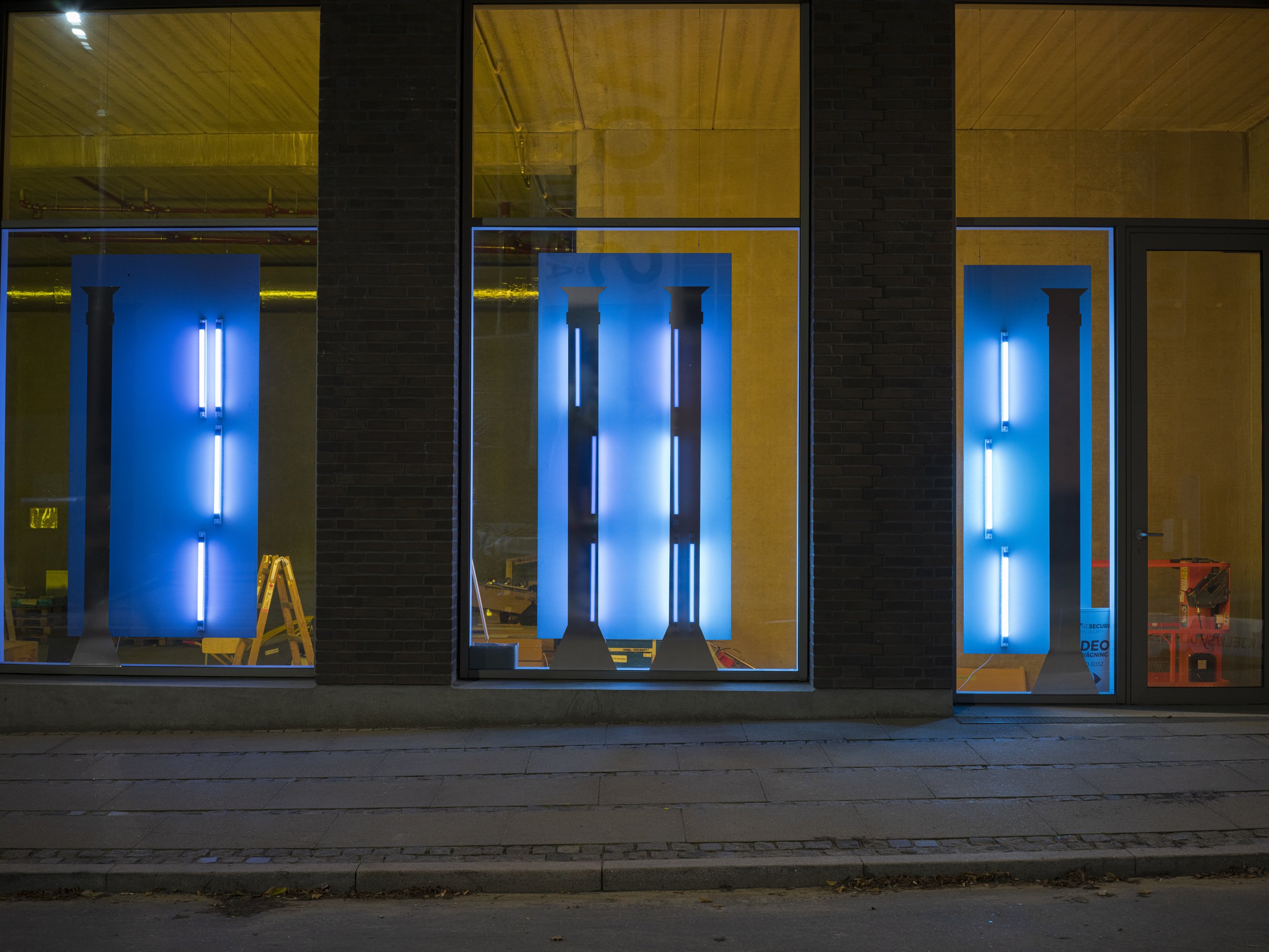
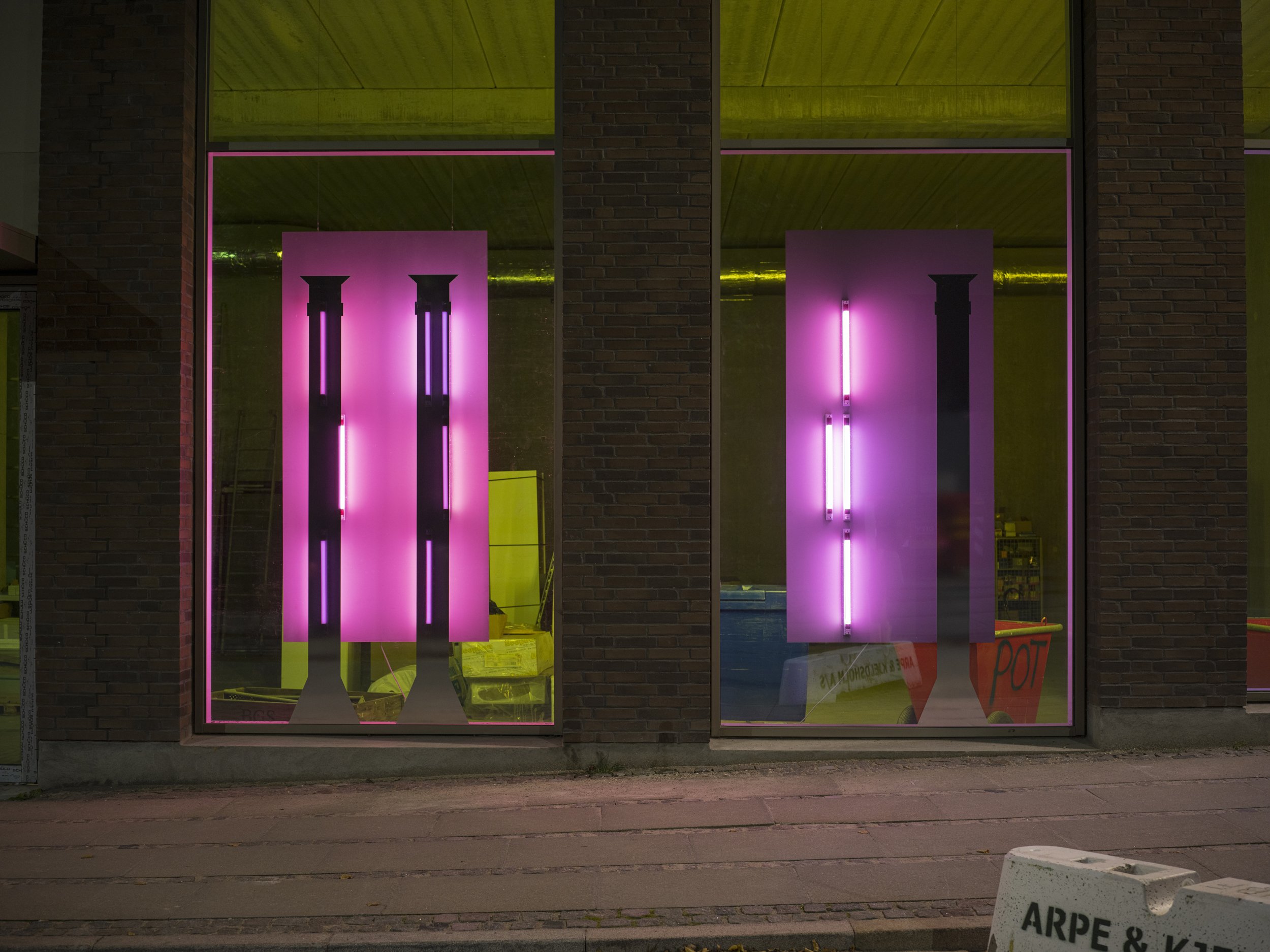
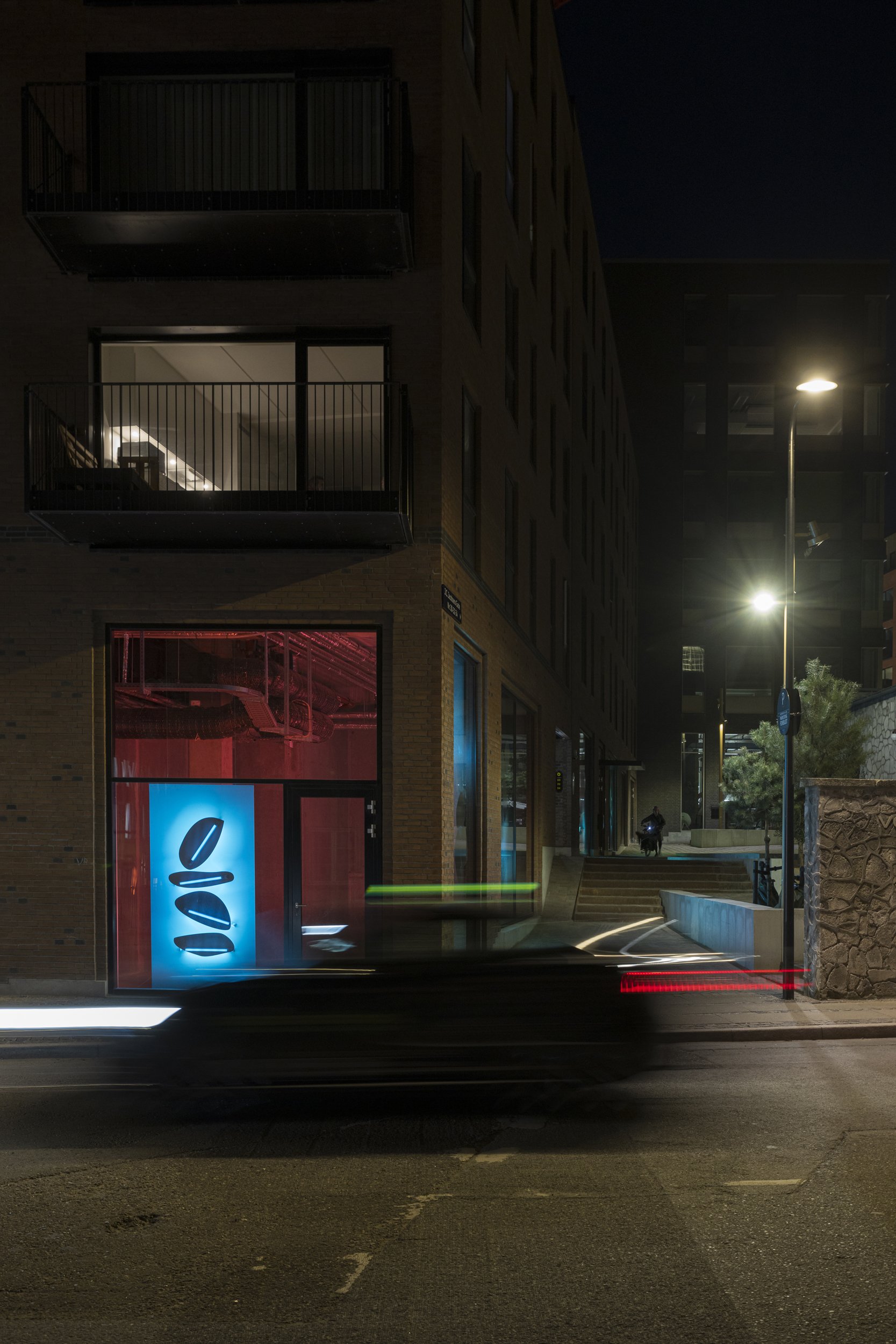
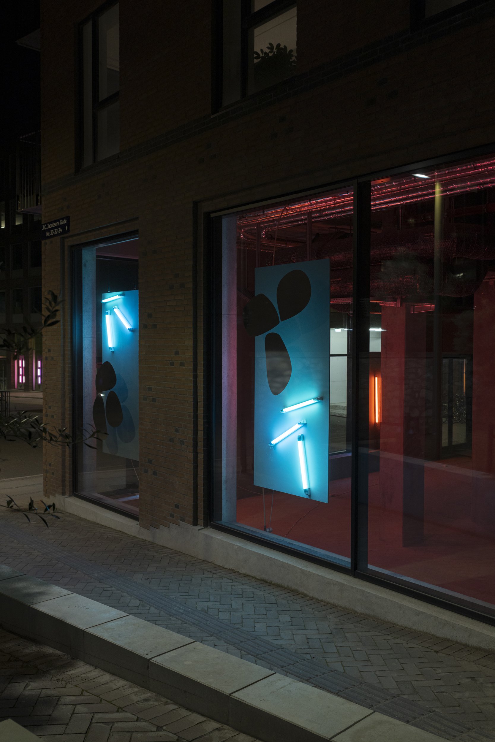
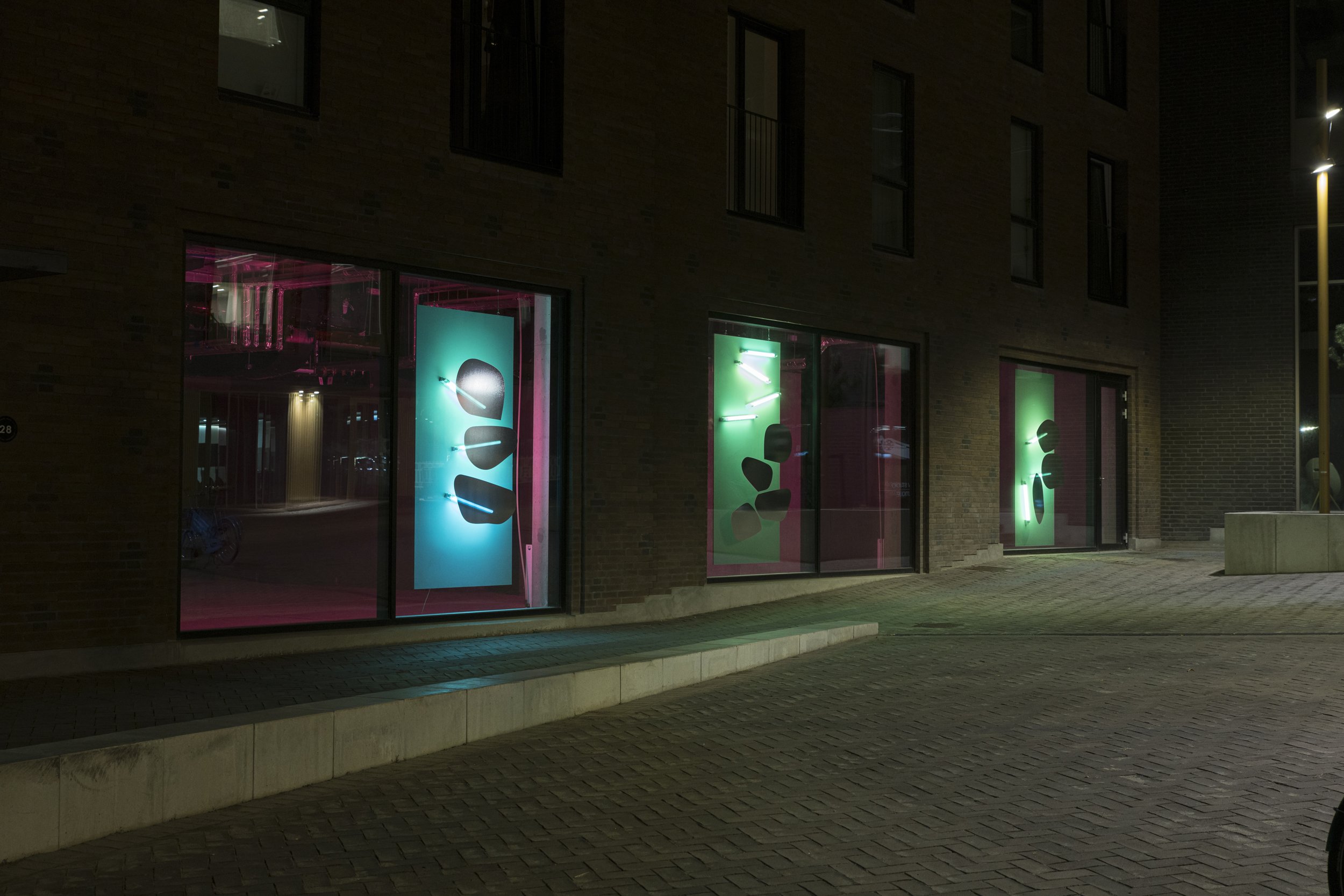
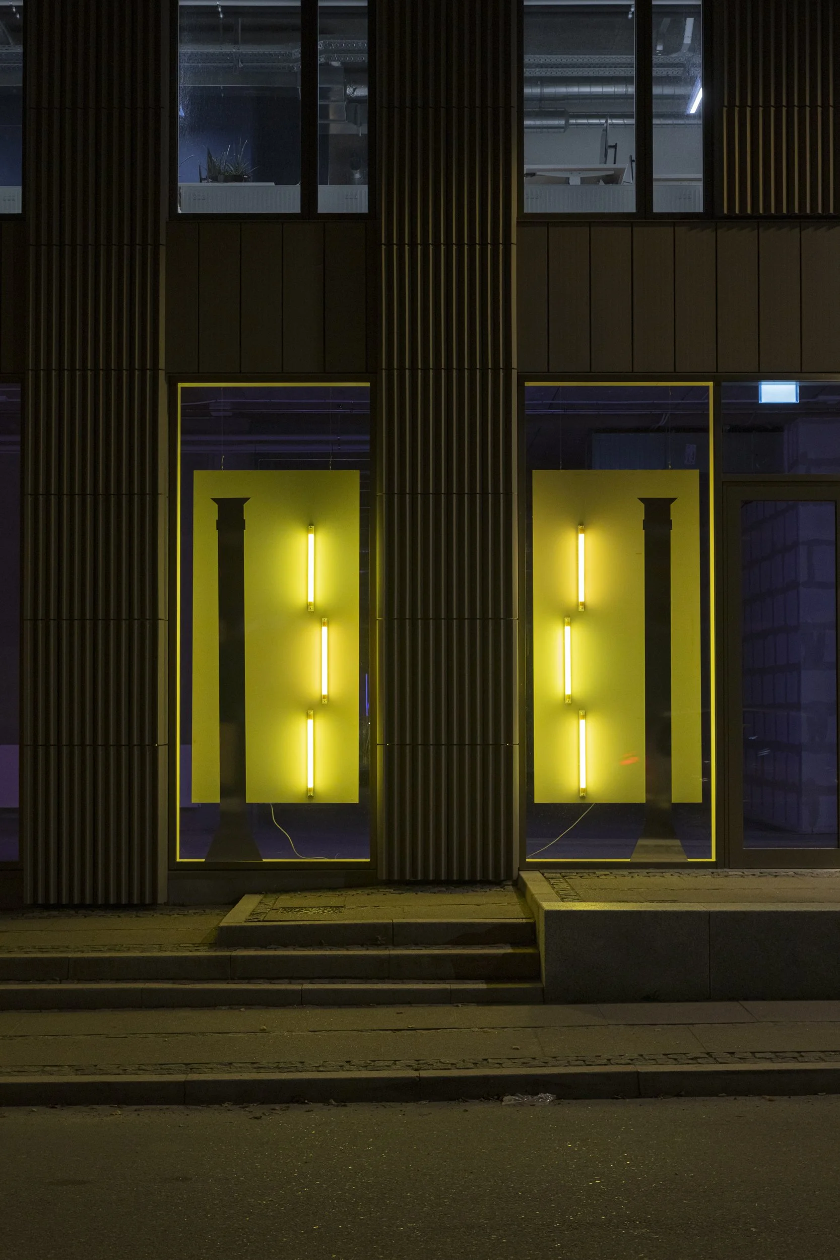
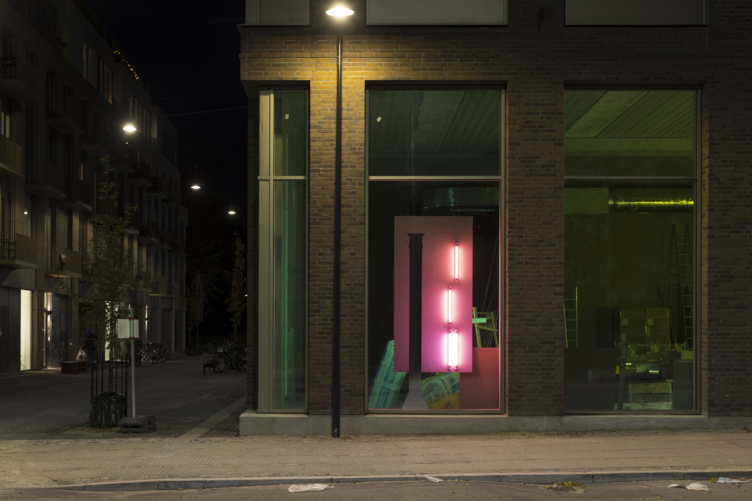
'City Light', consists of panels, fluorescent tubes and mirror foil, which are hung in the windows of Mineralvandshuset, Bønecke Hus and Steenstrup Hus on Pasteursvej in Carlsberg. LED tubes with color filters are installed on both sides of the panels. Mirror foil is attached to the outside of the windows, which reflects both inwards towards the light and outwards towards the street. This dual lighting and mirroring works both on its own and in tandem with each other. On some windows, mirror foil is thus placed on top of each other, and in others it is placed offset, or next to each other.
The inspiration for the design of the light and the mirror foils was taken from the surroundings at Pasteursvej, which 'Byen Lys' inhabits. The Mineral Water House and Bønecke House are adjacent to Kedelhuset, which will house the new Dance Halls. Here, light and foils establish a vertical stringency that in tandem imitates the chimneys from Kedelhuset on the other side of the street. In the same way, the bricks from Kridttårnet will shape the light and foil windows in Steenstrup Hus and create a more playful and arbitrary expression that imitates the rounded and randomly placed stones in the lighthouse.
The colors in 'Byens Lys' have been carefully selected to create a walk through the decorations on Pasteursvej. From the Mineral Water House, over Bønecke Hus to Steenstrup Hus, the colors develop from window to window, so that the viewer is encouraged to move through the entire installation. The colors are arranged to mimic a sunset, from yellow, orange, red, pink, magenta, violet blue. The back of the panels will be illuminated by the complementary colours, thereby achieving the greatest possible contrast between the front and the back.


